Comments

October 5, 2009

1. http://destinyplan.wordpress.com/2009/09/28/oil-painting-surrealism/#comments

2. http://smileflower.wordpress.com/2009/06/12/surrealism-painting/#comments

3.http://asukacherry.wordpress.com/2009/09/28/sec-4-coursework-character-designs/#comments

4. http://poohiefied.wordpress.com/2009/09/28/coursework-inspirations-from-artwork-4/#comments

5. http://kiyo0jinjin.wordpress.com/2009/09/28/cosmetic-drawing/#comment-17

Writings: Iconic Logo Designers

September 29, 2009

Michael Bierut

Michael Bierut is a graphic designer, design critic and educator. He was born in Cleveland, Ohio, in 1957, and  studied graphic design at the University of Cincinnati’s College of Design, Architecture, Art and Planning.

Bierut was vice president of graphic design at Vignelli Associates. Since 1990 he has been a partner in the New York office of Pentagram.
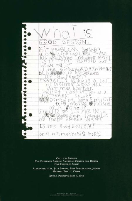
American Center for Design 100 Show Poster

American Center for Design 100 Show Poster

Brief Introduction:

Taken from http://howdesign.com/upload/images/PDF/bestworkbierut.pdf 


—MICHAEL BIERUT

The last image I show at almost every lecture I give is a

poster I did in 1992: a call for entries for the American

Center for Design 100 Show. I was the chair of the

judges panel that year.

I remember I was very confused at the time about

the direction that graphic design was taking, and about

the direction my own work was taking. It just seemed

to me that there were so many “style wars” raging that

it was diffi cult to think clearly.

As chair, it was my responsibility to design the

poster. All my anxiety came to a head over this project.

I thought about it for weeks and everything I could

think of seemed horrible. I was unable to produce

anything. The fact that the brief was wide open made

my creative block all the more embarrassing.

The ACD kept asking about the (nonexistent)

design. Finally, they asked me to provide a statement

to be printed on the back of the poster. I sent them a

stream of consciousness rant that came straight out of

my state of mind.

They suggested in turn that the statement be

printed on the front of the poster—an all type solution.

But picking the typeface was the problem. I

wanted to fi gure out a way to make it not about style at

all —in fact, to make it not about design at all.

Finally, I hit on the idea of having my daughter

Elizabeth, who was then 4-and-a-half years old, create

the poster. Elizabeth could not read yet, but she did

know her alphabet. I dictated the text to her letter by

letter. The result is what you see.

The American Center for Design no longer exists.

My daughter Elizabeth, however, is very much with us:

She graduates this year with honors from Swarthmore

College. She has no memory whatsoever of helping me

with my favorite poster.


His work is interesting and funky. He explores typography and is versatile in the way he handles the negative and positive spaces. The design is said to be one of his best works. It is done by his daughter when she was small. It is a very creative and it sets people wondering, “How did he comp up with such an out-of-the-world idea.”

Design: Coursework designs

September 29, 2009

Final Coursework designs

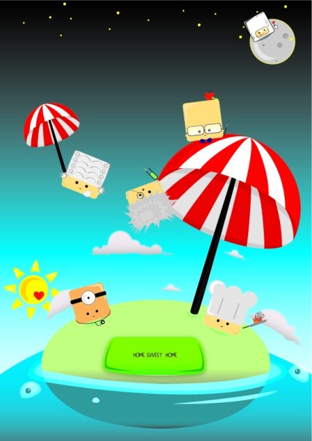
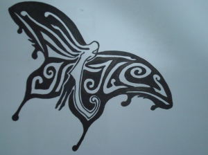
Characters

Characters


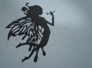
Fairytale ending?

Fairytale ending?

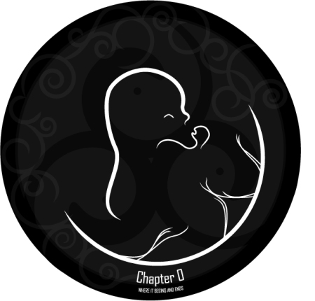
Namecard design/Packaging design (front)

Namecard design/Packaging design (front)

Namecard Design (back)

Namecard Design (back)

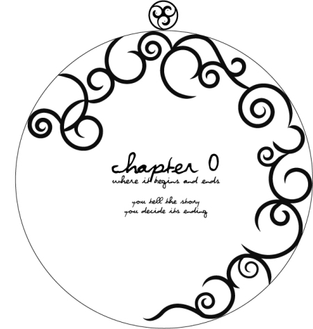
Packaging Design (inside)

Packaging Design (inside)

2D Works: Coursework Prep

September 29, 2009

Research on:

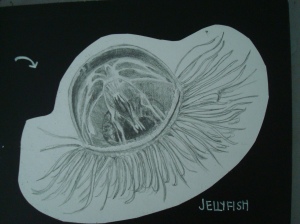
Jellyfish

Jellyfish

Jellyfish

Babies

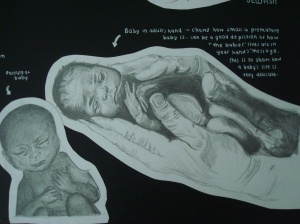
Premature baby

Premature baby

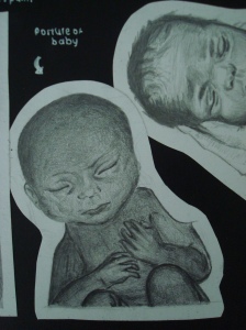
Baby

Baby

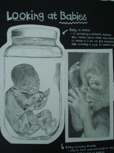
Bottled Baby

Bottled Baby

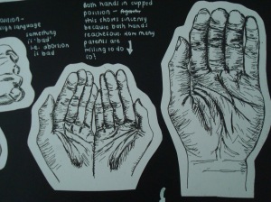
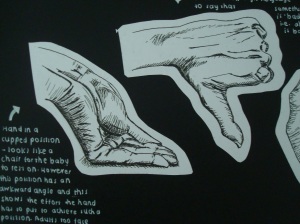
Hands

Hands

Hands

Hands

Hands

 Baby Merchandise

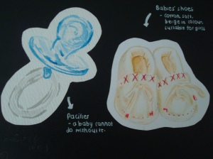
Pacifier and baby shoes

Pacifier and baby shoes

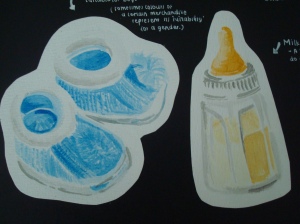
Baby shoes and Baby Bottle

Baby shoes and Baby Bottle

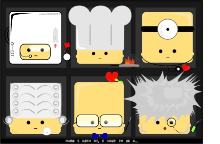
Occupations

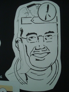
Doctor

Doctor

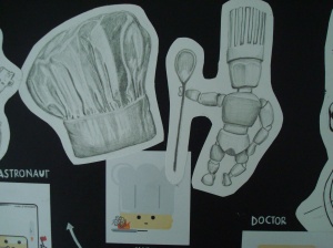
Chef

Chef

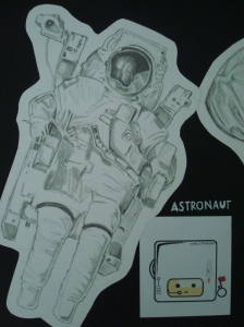
Astronaut

Astronaut

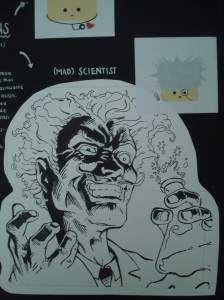
Scientist

Scientist

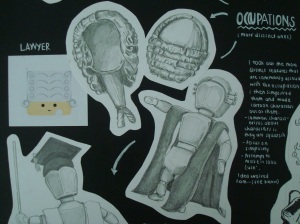
Lawyer

Lawyer

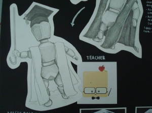
Teacher

Teacher

Others: 4th CDL Sculpture Competition entry

September 29, 2009
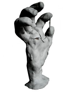
Left view

Left view

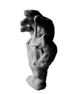
Right view

Right view

Title of work:

Man’s Clutches

Concept:

Man has disrupted the balance of nature, turning it into pawn, easily manipulated, to achieve greater gains which seemed undesirable now. The beauty and intricate connection between nature and man has been destroyed under the clutches of man’s greed. Yet the irony that exists is that while man wishes to reverse the devastating effects of its actions, it is still controlled by technology. The struggle to maintain balance has caused much pain and agony, yet man has chosen to take the light path and continue its fight and pursuit into striking and balance and reconnect the ‘blue and green’ to the ‘grey and black’. The sculpture is a ‘digitally controlled puppet’ hand as can be depicted by the ‘patch work’ sewed onto a hand and a digital control. Though it is controlled by technology, and manipulated like a puppet, being reduced to skin and bones, and bloodshed; Man struggles to piece back and regain control over its ‘human hand’ and reverse its action and maintain balance.


I enjoyed making this scuplture. Also, I’ve learnt that we could use newspapers to make the shape of whatever we scuplturing so that it can be hollow and easier to make. However, we must be careful when joing pieces together because they fall easily apart  after firing.

2D Works: Greek Sculpture

September 29, 2009

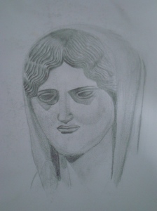
Title: Pencil Sketch of Greek Scuplture
Medium: Pencil
Size: A3
Date: 2009

Sketch

Sketch


Mrs Tan brought us to an art museam to view some famous Greek sculptures. Each of us selected a sculpture to sketch. Again, this exercise allowed us to practice and hone our sketching skills. We had to be observant of the tones and contours. This exercise posed as a challenge to me because this was one of my first few attempts to sketch a human face.

2D works: Cubes

September 29, 2009

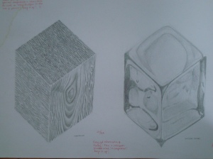
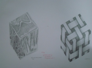
Title: Cubes
Medium: Pencil
Size: A3
Date: 2008

Wooden and Ice

Wooden and Ice

Aluminium and Impression (rattan)

Aluminium and Impression (rattan)

This was one of our first few sketching exercises. This exercise was for us to practice and hone our  pencil skills. During the exercise, we were supposed to look at different textures and take note of tones, light and shades. The 1st cube is a wooden surface, 2nd is ice, 3rd is aluminium foil and 4th is from imagination. I think the first 3 was done pretty well. The 3rd was done from impression, hence the cube is not ‘real’ because the dark areas at the corners are suppose to be non-existent.

Design: Sec 4 Graces Camp Logo Design

September 29, 2009
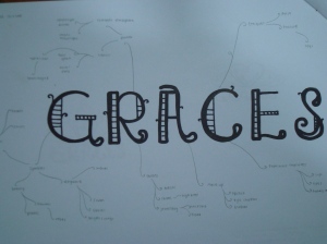
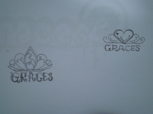
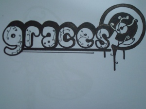
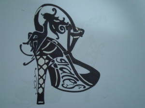
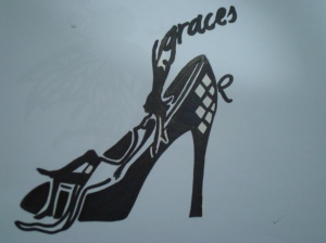
I enjoy designing logos. Because I can do it anytime, anywhere whenever I have the inspiration. Below are my Sec 4 Graces Camp logo designs
Graces (mind map)

Graces (mind map)

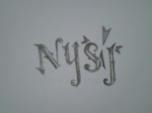
Fonts

Fonts

Design 1

Design 1

Design 2

Design 2

Design 3

Design 3

Design 4

Design 4

Design 5

Design 5

I like experimenting with font types and creating my own fonts. Personally, I like designs 2 and 3 the most. This is because I think high heels are very representitive of ladies. Also, the angle of the high heel drawn in designs 2 is very interesting. For design 3, the merging of two ladies creates an illusion.

Design: Tee designs

September 29, 2009
CCA Squad Tee

CCA Squad Tee

 CCA Squad Tee Design

This was done when I was learning how to use illustrator and learning from tutorials. The swirls form a heart. I like the nice and clean look to it.

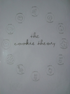
The cookie theory

The cookie theory

Front design

Front design

Squad Tee Design (Sec 1 and 2)

I created little cookie characters which represented each of us in our squad.

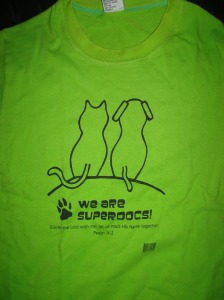
Church Tee Design- We are superdocs!

Church Tee Design- We are superdocs!

Church Tee Design

This was done last year for our binannual Vacation Bible Camp. The theme was “We are superdocs!” So I came up with this simple design with a cat and dog sitting together. Cats and Dogs are usually protrayed as ‘enemies’ of each other. However, in this camp, differences are put aside, becasue everyone has a chance to learn more about the bible.
2D Works: Sec 3 BT

September 29, 2009
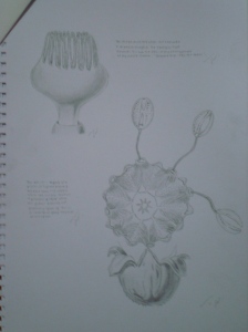
Title: Growing
Medium: Pencil
Size: A3
Date: 2008
Final composition

Final composition

Title:

Final work

Final work

Compositions

Compositions

Composition

Composition

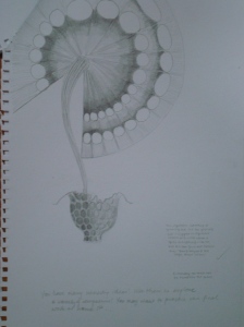
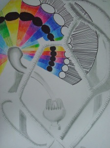
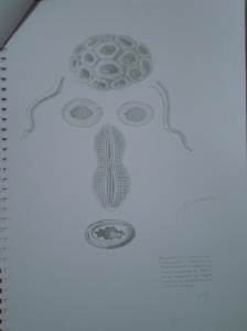
My strength lies in pencil sketching, hence the medium of my final work is pencil. The idea of my final work is a “flower” growing out of a cage. Again, my weakness lies in poor time management skills, hence I was not able to complete the final. I ended up compromising on the details such as the tones, hence it does not look 3D where it is supposed to be. Also, as I ran out of time, I used marker to finish off the uncompleted spaces, however it was not a good medium to use together with pencil. I should have tried it out at home first before attempting the final during the times period. Also, I could have explored more, such as using characteristics of the bacteria such as wavy and wriggly lines.